


After 100 volumes of the Pentecostal Messenger, we pause to review significant changes in form and style through each decade of the magazine's existence.
Spencer Ming
August 20, 2026
Topic:
Pentecostal History
Over the last 100 years, the Pentecostal Messenger has maintained a clear evangelistic mission, but a survey of the archive, from the first volumes in the late 1920s through to the latest issues in this Decade of Harvest, reveals that this publication has continually reinvented its design, writing, and methodology to suit each individual generation. Four developments stand out: the shift in format, the rise of the image, the evolution of the writing style, and the modernizing of the medium.
For its first three decades, The Messenger was a newspaper. The early issues were broadsheets of six and seven columns pressed margin to margin, printed in black ink on newsprint with no cover and few, if any, photographs. The nameplates grew increasingly ornate, reaching heavily engraved borders by 1937. The 1950s brought the first signs of real graphic: banners to represent ministry departments, a globe set over the World Missions column, and spot color and tints appearing on ads and other special pages. The writing matched the form. Doctrine, revival reports, missionary dispatches, and convention minutes filled the columns in a sort of King James cadence, much of it written as first-person field letters. The mission of this era was outward proclamation, taking the Gospel “to those outside of Pentecost,” with the paper itself serving as the movement's primary evangelistic tool.
The 1960s marked the most significant structural change in the magazine's history. By the early part of the decade, the newspaper had fully transitioned into a magazine, with a saddle-stitched spine and a designed cover now distinct from the interior content, usually printed in two- or three-color offset. Then, in the 1970s, editors took the magazine in a more technically advanced direction by introducing photojournalism. By the mid-70s, a single photograph filled the entire cover frame, and the interiors featured photo essays and multi-image spreads from the mission field. The writing reflected true magazine journalism, shifting from doctrinal essays to storytelling. As the organizational responsibility and global impact of the Pentecostal Church of God had grown, writers began reporting ministry and missions updates in church planting, education, student ministries, home and world missions, etc.
The 1980s and 1990s were defined by programming and promotion. Bold typography appeared alongside strong hero imagery, often featuring content designed to mobilize churches and ministry leaders around Sunday School enlargement, building campaigns, and church growth. By the late 1990s, the publication described itself, even on its cover, as The Pentecostal Messenger Ministry Magazine, using a blend of newsletter-style columns to share updates from the field and full-color feature articles to strengthen ministerial education.
Perhaps the most externally recognizable transitions have taken place post-2000. With the advent of advanced digital technology, recent editors have emphasized creativity in upgrading the magazine's visual appeal. In 2008, Charlotte Beal led an aggressive redesign that sought to produce clean editorial pages, disciplined grids, and full-bleed minimalistic covers. Additionally, in what was a somewhat controversial decision, the magazine was reimagined in an 11x11-inch page size—a sharp departure from the traditional 8 ½ x 11-inch format that had carried the magazine for 50+ years. Though unique, this choice allowed for much more horizontal design real estate and greater creative impact, and the redesign as a whole was ultimately well received. In fact, for these efforts, the Evangelical Press Association (EPA), the leading professional body for 300+ Christian publications, honored the Pentecostal Messenger with an Award of Merit for Most Improved Publication.
The 2010s pushed even further. The writing during this period grew more reflective and voice-driven, organizing around clear themes. Another redesign, led by Randy Lawrence, Jr. in 2013, reduced the size to a more accessible 8 ½ x 10-inch format, featuring a distressed “PM” logotype and in-house photography on the cover. In 2014, the EPA again honored the Pentecostal Messenger, this time granting it an Award of Excellence for denominational magazines, the highest honor in its category.
Over the last 10-15 years, significant changes have occurred in production and distribution. The monthly publication frequency was reduced from 11-12 issues per year to four in 2012 and to three in 2019; in 2021, digital distribution became the default delivery model (printed magazines remain available to subscribers and credentialed ministers upon request). That said, the Pentecostal Messenger maintains its commitment to high-quality production and communication. Each issue prioritizes forward-facing language meant to intentionally communicate mission and vision to this Movement. Furthermore, today's PM aims to refine the creative style for a contemporary audience, highlighting large-format hero imagery against minimalist typography, wide margins for ease of reading, and even QR codes that link print to digital.
Times have changed, but excellence remains. In 2020, the EPA again recognized the magazine, this time as a finalist in the most-improved category with special notice of its photography and treatment of themes such as PCG history and mission. Then in both 2024 and 2025, the PM earned Best in Class, Third Place, among publications under 3,000 in circulation. Together with the prior awards, these honors trace a multi-decadal record of steady editorial and visual maturation.
What the survey above makes clear is the fact that the Pentecostal Messenger's form has never settled. Layout, imagery, writing, and distribution have all changed along with the tools and culture of each era. However, there is a throughline, a constant that stretches across all 100 volumes—mission. Whether it is labeled as “aggressive evangelism by every available means” or “Strategy 2000” or “Decade of Harvest,” every broadsheet, photo essay, editorial redesign, and even digital output conveys a conviction that the written word can impact a reader… and can impact eternity. Methods change. Mission stays the same.
Want to ask a question, tell a story, or share what you've learned? Let us know!
Connect with our Team
Looking back on the history of the Pentecostal Messenger with editors Charlotte Beal, John Mallinak, Randy Lawrence Jr., and Spencer Ming.
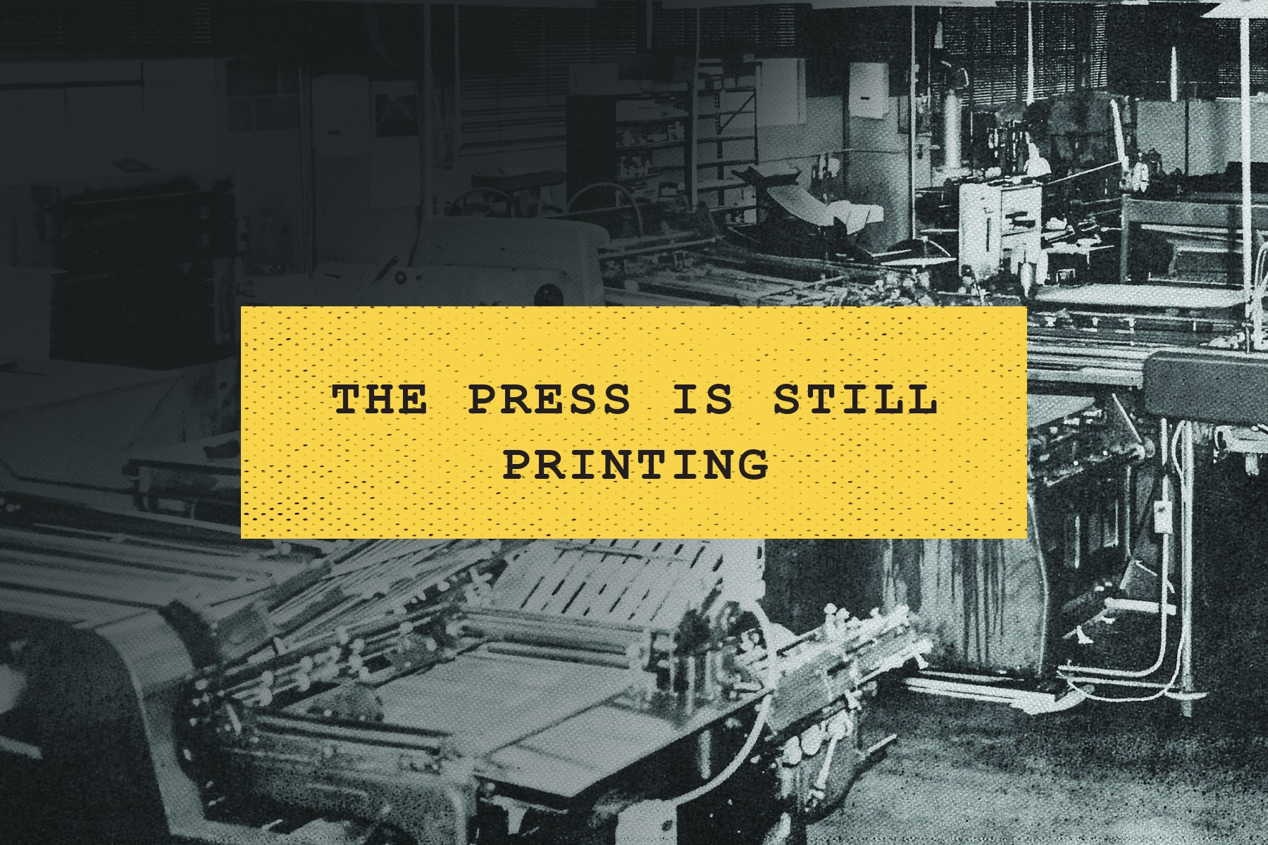
In celebration of the Pentecostal Messenger's 100th volume, we review the early foundations and legacy of this important publication.
General Bishop Virgil Kincaid pictures the PCG as one symphony movement with many parts under one Conductor, all moving together toward a crescendo.

© 2025 Pentecostal Church of God. All rights reserved.


